
3D embroidered lettering has exploded in popularity across apparel, bags, and team uniforms, delivering a raised, tactile design that adds depth and personality to every project. That dimensional effect not only catches the eye but also enhances durability and legibility when stitched on different fabrics. Whether you’re a hobbyist or running a boutique, choosing the right fonts, sizing, and placement can separate a memorable patch from something forgettable, especially with 3D puff embroidery as a consideration. This guide focuses on practical steps for selecting fonts that translate well to stitched form and sizing accurately to maintain readability across distances. By planning, digitizing, and testing, you can achieve professional, durable results that perform well from day one through multiple washes.
Beyond the exact term three-dimensional lettering, designers talk about raised lettering, puffed typography, and foam-backed text that stands off the fabric. This dimensional styling brings brand messages to life on jackets, caps, and bags by using layered stitching, careful stabilizers, and deliberate edge finishes. Think of textured typography created with foam padding, satin stitches, and strategic underlay to preserve legibility at a glance. In short, the goal is to elevate letters from flat embroidery to a tactile feature that communicates identity while withstanding wear.
3D embroidered lettering: Choosing fonts for depth and legibility
Choosing the right font is the foundation of effective 3D embroidered lettering. 3D embroidery fonts with bold, simple shapes translate more clearly into raised, dimensional forms, preserving legibility even when stitched with height. This Descriptive approach helps ensure that the chosen typeface maintains strong vertical and horizontal strokes, minimizing the risk of fine details vanishing behind foam backing.
When selecting fonts for 3D stitch work, it’s essential to test several options on swatches to observe how each letter reads at actual size. Consider using uppercase letters or widely spaced layouts for enhanced readability, and be mindful of how foam backing will lift the edges. This process ties into the broader world of custom embroidered lettering, where font choice directly influences perceived quality and brand tone.
Embroidery lettering sizing: balancing height, space, and readability
Embroidery lettering sizing is a practical art, balancing visual impact with practical garment constraints. A baseline height of about 1.0 to 1.5 inches works well for small logos and patches, while larger chest panels or back designs may require proportionally bigger lettering. Remember that embedding foam to achieve the 3D effect adds extra height, which can push the design into areas that demand a broader footprint.
For words or phrases, maintaining a consistent cap height helps preserve harmony across the design. A life-size mockup or stitched swatch can reveal how the letters read from target viewing distances, ensuring that the final result remains legible after washing and wear. This emphasis on embroidery lettering sizing supports durable, repeatable outcomes across diverse garments.
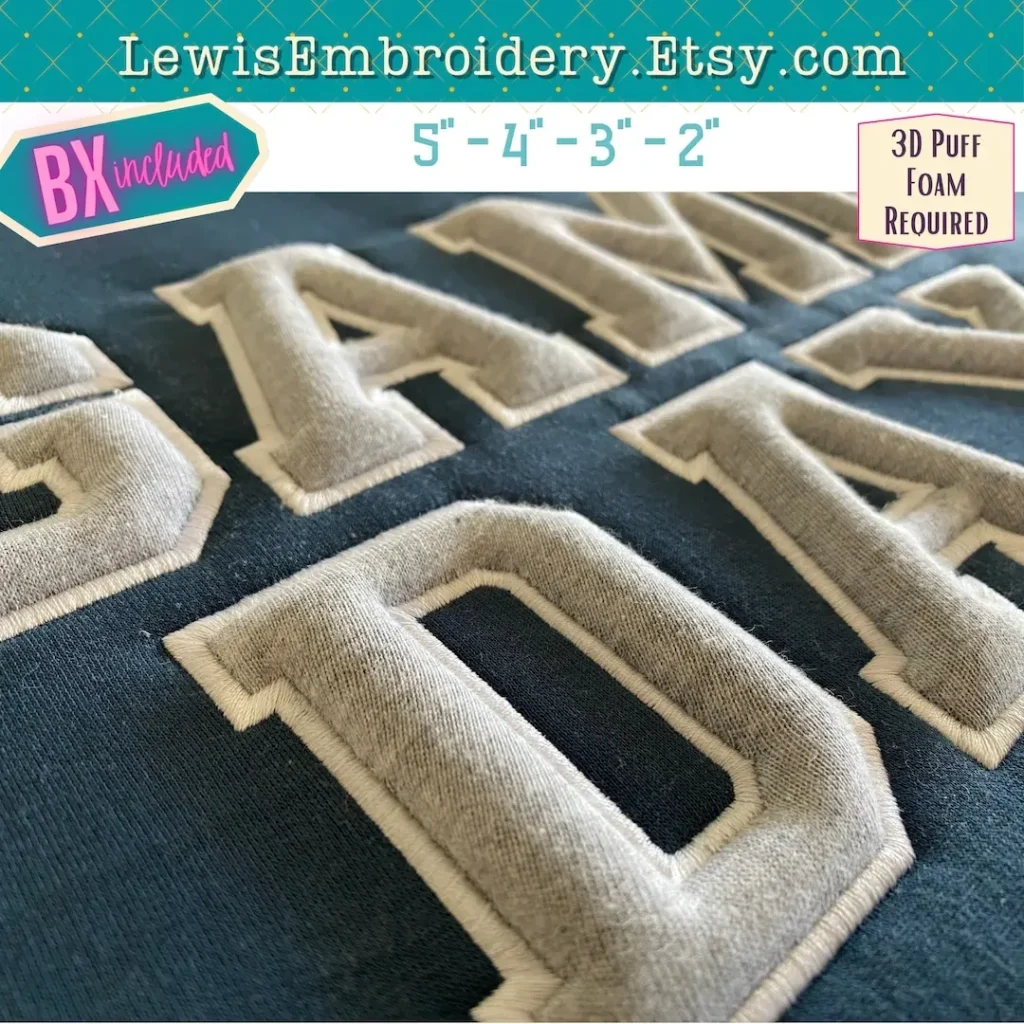
3D puff embroidery: adding height with foam backing
3D puff embroidery relies on foam backing to push stitches outward, creating a pronounced raised effect that catches light and attention. Foam thickness and density directly influence letter height and edge definition, so choosing a mid-weight foam is a practical starting point for clean outlines without overpowering delicate strokes.
Stabilizers play a crucial role in maintaining print-like crispness when using foam. Open, cut-away, or tear-away stabilizers each contribute differently to the final stiffness and durability of 3D embroidery letters. The combination of foam, stabilizer, and thread choice determines how robust and readable your 3D lettering remains through repeated washing and active wear.
Embroidery placement tips: positioning for visibility and durability
Embroidery placement tips emphasize alignment with garment seams and natural body lines to maximize visibility. Larger designs tend to perform best on the back or chest, while smaller patches fit well on sleeves or caps. Ensuring symmetry across two sides of a logo or wordmark helps maintain a balanced, professional look.
Curved surfaces pose specific challenges for 3D lettering, as cap brims and sleeve curves can distort the height illusion. Always verify positioning with a fabric ruler or tape measure, and test on a similar cap or garment before final stitching. These practical checks support consistent embroidery placement that meets durability and readability goals.
Custom embroidered lettering: turning concept into repeatable designs
Custom embroidered lettering starts with a clear brief: define the message, brand voice, and target audience. This process involves selecting fonts that respond well to a 3D effect, planning for foam backing, and anticipating the garment type and care expectations. The goal is a repeatable workflow that produces professional results aligned with brand identity.
A successful custom embroidered lettering project also depends on digitizing and testing. Digitizing translates the font into stitch paths, requiring careful padding, edge satinization, and stabilization choices. Running small test stitches on similar fabrics helps confirm the 3D effect, ensuring the final piece reads clearly and wears well across multiple productions.
Digitizing for 3D lettering: from font to crisp 3D edges
Digitizing for 3D lettering is the unseen engine behind a strong 3D effect. The digitizing stage builds up foam height with padding stitches and defines outer edges with crisp satin or fill stitches. This process hinges on the chosen 3D embroidery fonts and how well the digitized paths translate to the machine’s stitch language.
Careful control of stitch density, underlay, and float areas helps preserve legibility on various fabrics. Testing at actual size—stitching on a swatch that mirrors the final garment—ensures the design maintains dimensionality without puckering or distortion. Accurate digitizing supports not just a visually impactful result but also the durability required by repeated washing and wear.
Frequently Asked Questions
What are 3D embroidery fonts and how do they influence embroidery lettering sizing in 3D embroidered lettering?
3D embroidery fonts are bold, simple letterforms designed to read clearly when stitched with height. They influence embroidery lettering sizing because the raised strokes take up more vertical space and can reduce perceived readability at smaller scales. Start with a baseline height of about 1.0–1.5 inches for small logos, and increase for larger back panels. When foam backing is used to create the 3D effect, the overall height grows, so always print a life-size mockup or stitch a swatch to verify readability on your fabric.
How does 3D puff embroidery affect readability, and what are essential embroidery placement tips for 3D embroidered lettering?
3D puff embroidery uses foam backing to push stitches outward, creating raised lettering that boosts visibility but may require larger letterforms. For placement, align text with garment seams, reserve space for the foam height, and consider curved surfaces on sleeves or hats. Always test on a similar fabric to confirm readability at your target distances and adjust spacing or font choice if needed.
Which fonts work best for 3D embroidery fonts when creating custom embroidered lettering?
For 3D embroidery fonts, choose bold, simple letterforms with strong vertical and horizontal strokes, and avoid very narrow details that can disappear under foam. Favor uppercase or widely spaced lettering to enhance legibility. When pursuing custom embroidered lettering, you can tailor fonts to balance brand identity with readability, ensuring the raised effect remains clear after stitching.
How should I approach embroidery lettering sizing for different garment sizes when working with 3D embroidered lettering?
Embroidery lettering sizing matters because readability drops with distance. Start with baseline heights around 1.0–1.5 inches for small patches and scale up for larger panels, keeping consistent cap height for longer words. Foam backing adds height, so re-check the overall footprint after adding foam. Create life-size mockups or stitch a swatch to verify legibility on target garments.
What are embroidery placement tips for placing 3D embroidered lettering on curved surfaces like sleeves and caps?
Placement tips include aligning text with garment seams and natural lines, placing larger designs on the back or chest for maximum visibility, and carefully handling curved surfaces such as sleeves or caps. Test on a similar item, use appropriate stabilizers, and validate symmetry with a ruler or template to ensure the 3D puff effect stays readable.
What is the typical digitizing workflow for custom embroidered lettering to achieve durable 3D embroidered lettering?
A practical digitizing workflow for 3D embroidered lettering starts with padding stitches to build height, crisp satin or fill stitches around the edges for definition, and a stabilizing underlay to support curves. Use foam backing and the right stabilizers, and keep stitch density balanced to preserve fabric integrity. Always test actual-size stitches on similar fabric and adjust before production to ensure durable, high-quality 3D lettering.
| Topic | What it means | Why it matters |
|---|---|---|
| Fonts for 3D embroidery | Choose bold, simple letterforms; avoid very narrow or intricate details that can disappear with foam; prefer uppercase or widely spaced lettering; test a few font options on swatches before finalizing the design. | Font choice directly influences legibility and the perceived 3D depth; a poor font can read as blurry or unreadable at stitch height. |
| Sizing and scale | Baseline height around 1.0–1.5 inches for small logos; scale up for larger areas; maintain consistent cap height for longer words; when foam is embedded, add height and test with life-size mockups or swatches. | Sizing preserves readability from target distances and prevents designs from appearing cramped or oversized. |
| Placement | Align lettering with garment seams; place larger designs on back or chest for visibility; consider curved surfaces (sleeves, caps); verify symmetry with a ruler; test on similar caps for curvature. | Placement impacts visibility and how the 3D effect reads from typical viewing distances. |
| 3D puff embroidery materials | Foam backing pushes stitches outward; foam thickness and density determine height and edge crispness; choose stabilizers (open, cut-away, tear-away) for the fabric; combined with foam and thread define the final look. | Material choices affect durability, edge clarity, and the overall 3D presence. |
| Digitizing for 3D lettering | Digitizing should include padding stitches to build height; crisp satin or fill stitches around edges; proper underlay to stabilize loops; test at actual size; adjust stitch length, density, and underlay as needed. | Good digitizing ensures the 3D effect reads clearly and stays reproducible across projects. |
| Care and maintenance | Turn garments inside out for washing; use gentle cycles; avoid high heat; dry flat or on low heat; foam backing and thread integrity influence longevity. | Care impacts longevity and keeps the 3D height and edge sharpness after repeated washing. |
| Practical workflow | Define the message, select a font readable at target size, and plan for 3D with foam backing and stabilizers; digitize with padding and edge definition; test on swatch; apply to final garment; perform quality check after pressing and washing. | A repeatable workflow yields professional, durable 3D embroidered lettering with consistent results. |
Summary
3D embroidered lettering is a tactile way to elevate branding across apparel, bags, and team uniforms, blending bold typography with raised depth for a standout effect. In practice, it relies on bold, legible fonts, careful sizing to match typical viewing distances, and placement that respects garment seams and surfaces. The technique often uses foam backing and stabilizers to create height and durability, while digitizing adds the stitch paths and edge definition needed for crisp results. By mastering fonts, sizing, placement, and the interaction of foam, stabilizers, and stitching, you can produce durable, eye-catching lettering that performs after washing and wear. Whether updating a sports jersey, labeling uniforms, or crafting branded accessories, 3D embroidered lettering brings personality and professional polish to every project.