
Design a professional custom banner on a budget by combining clear goals with smart tool choices to deliver a polished, on-brand result. With careful planning, you can map out audience needs, choose suitable sizes, and select cost-effective materials to maximize impact without overspending. This intro-oriented guide blends practical design tips with affordable options, highlighting how professional results can emerge from accessible tools and templates. From typography and color to layout and licensing, the approach stays focused on delivering legible, compelling banners aligned with your business goals. As you explore ideas such as an affordable custom banner design and efficient production, you’ll see how preparation reduces waste, saves money, and boosts performance.
Design a Professional Custom Banner on a Budget: Goals, Audience, and Constraints
When you’re learning how to design banners for business, start by clearly defining what success looks like. Identify the banner’s purpose—whether it’s to drive foot traffic, collect sign-ups, or announce a limited-time offer—and pin down the audience who will read it at a glance. This upfront clarity guides every design decision and helps you stay focused on a budget-friendly outcome. By aligning goals with audience needs, you’ll lay a solid foundation for a professional banner design on a budget.
Next, translate those goals into concrete constraints: banner size, viewing distance, printing method, and a clear budget ceiling. These parameters shape color choices, typography, and imagery, preventing scope creep and waste. If you’re aiming for an effective, cost-conscious result, this planning stage is non-negotiable and sets the tone for affordable custom banner design that remains impactful.
Choosing the Right Banner Type and Size for Maximum Impact
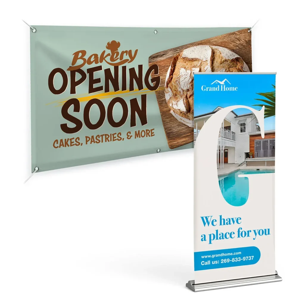
Banners come in many forms, from vinyl outdoor banners to indoor fabric options and mesh banners for windy venues. The type you select affects materials, durability, and overall cost, so balance the initial outlay with expected use. For a budget-friendly project, a moderate-thickness vinyl banner can offer durability both indoors and outdoors, while maintaining a reasonable price point. If you’re optimizing for digital presence, a hero image with a strong aspect ratio (at least 16:9) can serve as an economical online banner.
Size matters for legibility and impact. Common choices like 3×6 feet or 4×8 feet provide good visibility in many settings, but always align size with the distance readers will be from the banner. This practical approach supports professional banner design on a budget by ensuring messages are legible without needing oversized or overly complex artwork, and it helps you plan production efficiently.
Build a Budget-Conscious Design Plan
A solid design plan reduces waste and keeps costs predictable. Start with must-have elements: your logo, a concise headline, a subheading or call-to-action, and essential contact details. Choose a color palette aligned with your branding and avoid costly color separations in printing. Keep typography simple and legible from a distance. By outlining these elements first, you foster an affordable custom banner design that looks polished rather than cluttered.
Leverage ready-made templates or low-cost tools to streamline layout while preserving a professional appearance. This template-driven approach is central to affordable banner design, enabling you to iterate quickly without outsourcing every element. When budgeting, also plan for licensing where needed and reuse brand assets to maximize impact without inflating costs, all while maintaining room for creative customization and ideas.
Pick Tools and Templates That Fit a DIY-to-Pro Budget
A wealth of free and low-cost tools helps you craft professional banners without high design fees. Platforms such as Canva, Figma, and Crello offer customizable templates that can reflect your brand, while vector editors like Inkscape or Affinity Designer provide more control at a one-time cost. Ensure print-ready exports include CMYK settings, proper bleed, and margins, so your design travels cleanly from screen to print.
Beyond tools, tap into free stock images and licensed icons to supplement visuals without breaking the bank. The goal is to balance features with budget constraints, supporting a design that feels premium without requiring expensive outsourcing. This approach embodies the DIY banner design tips ethos—iterate, test, and refine until the result reads as a professional banner design on a budget.
Visual Design Essentials: Typography, Color, and Layout
Great banners communicate through clear visual hierarchy. Start with a bold, scannable headline that reads from a distance, then follow with a subheading or bullet points that reinforce the message. Use high-contrast color combinations and limit typography to two or three font families to maintain consistency and legibility. A strong call-to-action should stand out, perhaps through a contrasting button or a prominent size.
Layout and spacing matter as much as content. Generous margins and consistent padding create a readable, grid-based structure even under budget constraints. When designing, consider color psychology in alignment with your brand while ensuring legibility across different substrates and lighting conditions. These typography and layout decisions are central to professional banner design on a budget and help the message land with impact.
Content and Layout: Telling Your Story Quickly
Banners aren’t long-form content. Craft a strong primary headline that communicates your value proposition, followed by a brief subheading or bullets that support the core message. Place your logo prominently but avoid crowding the edges, and include a clear call-to-action such as “Visit us today” or “Shop now.” Tailor the message to the context—what customers should do next, and why it matters—so the banner resonates immediately, a key insight in DIY banner design tips.
A simple, grid-based layout often yields the most professional-looking result while keeping costs down. Short, scannable lines let readers grasp the offer at a glance, and avoiding overly complex illustrations reduces production risk. This approach aligns with custom banner design ideas by prioritizing clarity, speed-to-read, and budget-friendly execution.
Images, Logos, and Licensing Considerations for a Sharp Look
Images can elevate a banner, but licensing, resolution, and usage rights matter. Use high-resolution logos and photos that don’t require expensive licenses, aiming for at least 300 DPI for print. When using stock imagery, select options with commercial licenses and minimal background complexity to prevent visual distractions.
For outdoor displays, choose visuals that withstand environmental conditions and remain legible from a distance. Proper licensing and careful image selection preserve a professional appearance while controlling costs, reinforcing the concept of affordable custom banner design and protecting your brand integrity.
Print Materials, Finishes, and Durability on a Budget
Printing drives cost, but smart material choices can balance durability with price. Vinyl remains a versatile option suitable for both indoor and outdoor use, offering weather resistance without excessive cost. Finishes like matte or gloss can influence glare and readability, so choose based on lighting and setting.
If you’re planning a short-term event, a lighter substrate may suffice, while longer-term displays might justify a sturdier option. Always confirm printer recommendations for color profiles and bleeds, and provide print-ready files with CMYK conversion and a 0.125-inch bleed. These practical steps help you deliver a professional banner design on a budget without compromising quality.
Production Preparation and Final Checks: Printing on a Budget
Prepare your final files with production in mind. Use vector-based logos and design elements when possible to preserve crisp edges at any scale. Set the document to the correct size with bleed, convert to CMYK, and outline or embed fonts to avoid substitutions. Saving a PDF/X-1a or equivalent ensures printers receive a robust, print-ready file that minimizes color shifts and asset loss.
Create a fallback version with a simpler layout for any printer adjustments, and perform a last proof before printing. This careful production workflow keeps revisions down and budgets in check, supporting a smooth transition from DIY concepts to a professional banner design on a budget. It also aligns with the broader idea of continuing to generate custom banner design ideas that work across print and digital media.
Conclusion: From Idea to Impact on Any Budget
A well-executed banner doesn’t require a big budget; it requires clarity, branding, and smart production choices. By planning upfront, choosing the right tools, and applying solid design principles, you can achieve banners that look polished and perform well—without the price tag of high-end agencies.
By following these steps, you’ll improve visibility, reinforce your brand, and deliver professional results that respect your budget. Whether you’re optimizing for a physical display or a digital banner, the core concepts remain the same: clear messaging, purposeful design, and a pragmatic production approach. This journey builds your repertoire of custom banner design ideas and supports sustainable growth for your business.
Frequently Asked Questions
How can I design a professional custom banner on a budget while ensuring it meets specific goals and audience needs?
Begin with clear goals, audience, and constraints to guide every design choice. For a budget-friendly result, choose a suitable banner type (like vinyl for indoor/outdoor) and use templates to speed layout without sacrificing polish. Create print-ready files with CMYK, proper bleed, and a simple type hierarchy to ensure legibility from a distance. This disciplined approach keeps your professional banner design on a budget focused and effective.
What is the best approach for an affordable custom banner design for a business event or storefront?
Define the context (event or storefront), pick a cost-effective size (e.g., 3×6 or 4×8) and a durable yet affordable material such as vinyl. Use a concise layout and a strong headline; leverage affordable template-based design tools to assemble the banner. Ensure the design balances branding with readability, and export print-ready files in CMYK with bleed before sending to a printer.
What are DIY banner design tips to achieve a professional look on a budget?
DIY banner design tips to look professional on a budget: limit to two or three fonts, use a bold headline, apply a clear visual hierarchy, maintain generous margins, and keep text concise. Use vector logos where possible, license stock images, and stick to a high-contrast color scheme for readability from far away. Export assets correctly (CMYK, print-ready) to avoid last-minute issues.
How to design banners for business on a budget without overspending?
How to design banners for business on a budget: start by defining goals and audience, then select cost-effective tools (Canva, Inkscape) and a simple color palette. Build a plan that prioritizes a strong headline, clear CTA, and branding elements, while avoiding unnecessary details. Create print-ready files with appropriate bleeds, and test legibility at different viewing distances.
What custom banner design ideas deliver high impact on a tight budget?
Custom banner design ideas that stay affordable: align colors with your brand, use a strong single-message value proposition, and include a prominent CTA. Use high-quality stock imagery with commercial licenses, keep the layout grid-based, and reserve a few budget-friendly finishes like matte coatings to reduce glare. For digital banners, design with 16:9 aspect and optimize for quick scans.
What steps from concept to print ensure a professional custom banner on a budget stays within budget and quality?
From concept to print, follow a practical process: define goals and audience, choose banner type and size, draft a concise plan, select budget-friendly tools, craft a scannable layout with a bold headline and CTA, verify licensing for imagery, prepare print-ready files (CMYK, bleed, embedded fonts), and review a proof before printing. This structured workflow helps you design a professional custom banner on a budget while maintaining quality.
| Section | Key Points |
|---|---|
| Introduction |
|
| 1) Define goals, audience, and constraints |
|
| 2) Choose the right banner type and size for impact |
|
| 3) Build a budget-conscious design plan |
|
| 4) Pick tools and templates that fit a DIY-to-pro budget |
|
| 5) Visual design essentials: typography, color, and layout |
|
| 6) Content and layout: telling your story quickly |
|
| 7) Images, logos, and licensing considerations |
|
| 8) Print materials, finishes, and durability on a budget |
|
| 9) File setup and production workflow |
|